
We’ve all encountered websites that captivated us instantly, whether through stunning visuals, compelling content, or an innovative presentation we hadn’t seen before. This immediate engagement is crucial, as holding an audience’s attention is paramount to converting visitors into customers. This article will delve into what constitutes a “cool” or eye-catching web design, moving beyond the subjective to explore the objective elements that make a site truly appealing. A cool design is not just aesthetically pleasing; it’s smart, memorable, and above average, prompting potential clients to revisit and explore further. While templates offer a starting point, true uniqueness comes from strategic incorporation of features that maintain interest, offer value, and ultimately encourage purchases. The goal is to craft a website that not only grabs attention immediately — preventing visitors from bouncing to competitors — but also provides an intuitive, enjoyable user experience. Striking the right balance with content, avoiding both excessive text that feels spammy and insufficient text that harms SEO, is key. Ultimately, a truly “cool” website possesses an “oh my god” factor, something uniquely impressive or a superior execution of common features that outshines competitors. This article will explore the foundational factors of impactful web design, discuss how to implement them for maximum appeal, and highlight why an attractive, user-friendly design is indispensable for educating clients and driving sales.

User Experience (UX)
We’ve all encountered websites that captivated us instantly, whether through stunning visuals, compelling content, or an innovative presentation we hadn’t seen before. This immediate engagement is crucial, as holding an audience’s attention is paramount to converting visitors into customers. This article will delve into what constitutes a “cool” or eye-catching web design, moving beyond the subjective to explore the objective elements that make a site truly appealing. A cool design is not just aesthetically pleasing; it’s smart, memorable, and above average, prompting potential clients to revisit and explore further. While templates offer a starting point, true uniqueness comes from strategic incorporation of features that maintain interest, offer value, and ultimately encourage purchases. The goal is to craft a website that not only grabs attention immediately — preventing visitors from bouncing to competitors — but also provides an intuitive, enjoyable user experience. Striking the right balance with content, avoiding both excessive text that feels spammy and insufficient text that harms SEO, is key. Ultimately, a truly “cool” website possesses an “oh my god” factor, something uniquely impressive or a superior execution of common features that outshines competitors. This article will explore the foundational factors of impactful web design, discuss how to implement them for maximum appeal, and highlight why an attractive, user-friendly design is indispensable for educating clients and driving sales.
Effortless Navigation
Every website, regardless of its purpose, hinges on effective navigation. Think of it as your site’s menu bar – the essential guide that directs visitors through your content and offerings. If your navigation is confusing or difficult to use, you risk losing valuable traffic and conversions. When users can’t find what they’re looking for, they’re likely to leave and seek out a competitor, directly impacting your bottom line.
So, how do you ensure your navigation stands out? While a navigation bar is a necessity, you can transform it into a powerful tool for engagement. The goal is to make exploring your website a seamless and enjoyable experience for your visitors. After all, as a business owner, your ultimate aim is to sell your goods or services. A visually appealing website is crucial for capturing attention, but if users can’t easily find their way around, that aesthetic appeal becomes moot. Consider the example of Feed Music’s website; their sophisticated navigation actively engages users, effortlessly guiding them through the site with a simple scroll. By making navigation intuitive and engaging, you not only enhance the user experience but also significantly boost your chances of converting visitors into satisfied customers.
Strategic White Space
The Power of Strategic White Space
White space, often referred to as negative space, is not simply “empty” space on your website; it’s a powerful design tool that enhances user experience and strengthens your message. This crucial element can be any background color or texture, serving to highlight specific elements, segment content, and provide visual relief for your visitors’ eyes.
There are two primary types of white space: micro white space and macro white space. Micro white space refers to the smaller gaps you see between text characters, lines, and paragraphs. Though seemingly insignificant, its absence would transform your website into an overwhelming, unreadable block of text. Conversely, macro white space is the larger, more substantial empty areas used to separate major sections or components of your page. While effectively utilizing macro white space can be challenging, it’s key to achieving a clean, polished, and sophisticated aesthetic for your website.
To implement white space effectively, avoid overwhelming users with densely packed content. Instead, ensure each element on your page has adequate room to breathe and stand out. White space is your ally in drawing attention to specific words, images, or calls to action (CTAs). Don’t be afraid to use it generously; it helps create a sense of order and sophistication.
The benefits of incorporating ample white space are numerous. It significantly improves readability and comprehension, allowing visitors to quickly and easily digest your content. While there might be a temptation to fill every empty corner, this strategic emptiness enables your clients to absorb information more effectively, leading to a superior overall experience. After all, a beautiful website is pointless if users can’t understand your offerings or navigate to make a purchase. White space also plays a vital role in emphasizing your CTA, ensuring it stands out and guides users toward desired actions. Furthermore, it’s an excellent technique for achieving visual balance on your page, preventing a cluttered appearance while still providing sufficient content to convey your brand’s essence. Think of Apple’s minimalist MacBook website, a prime example of exceptional design that masterfully leverages white space. This strategic use allows each element to pop and the user to comfortably take in the entire experience, clearly understanding the brand’s message.
Clear Call to Actions
A Call to Action (CTA) is a pivotal element on any website, serving as a direct prompt – be it a button, phrase, or distinct feature – designed to convert visitors into leads or customers. It explicitly urges users to take a desired action, such as purchasing a product, subscribing to a newsletter, booking a service, or initiating a free trial. For maximum impact, a CTA should be strategically placed “above the fold” (visible without scrolling) and visually distinct from other elements on the page, leveraging the effective use of whitespace to draw the eye. This prominence is crucial because, without an immediate and clear directive, visitors are less likely to engage with your offerings.
CTAs are invaluable for guiding user behavior, much like effective navigation. In today’s fast-paced digital world, users expect to find what they’re looking for instantly. A well-designed CTA not only clarifies the next step but also instills a sense of immediacy and purpose. Consider Spotify’s website as a prime example: with its simple yet powerful “free” offer and the bold, catchy slogan “Music for everyone,” their CTA immediately communicates value and encourages engagement. By directing visitors to specific actions, CTAs streamline the user journey, making it quicker and more intuitive, ultimately driving conversions and business growth.
Impactful Images
High-quality imagery on your website means more than just good resolution; it encompasses clear, “non-pixelated” photographs that reflect professionalism and attention to detail. While stock photos can be a convenient resource, they often carry a generic or “manufactured” feel that can detract from your brand’s authenticity. If you do opt for stock imagery, choose it judiciously to avoid appearing inauthentic. Crucially, always avoid fuzzy, poor-quality photographs, as they not only look unappealing but can also convey a lack of professionalism, potentially eroding user trust. Investing in professional photography, or enlisting someone skilled in the craft, is a worthwhile endeavor that significantly enhances your overall website design.
Why is this so important? Compelling photographs can powerfully showcase your products, effectively capture the essence of your business, and vastly improve your website’s aesthetic appeal. A striking, bold header image, for instance, can immediately grab attention and effectively highlight your core offering. Fresh, engaging, and innovative visuals naturally pique viewer interest, encouraging them to delve deeper into your product or service.
The benefits extend beyond mere aesthetics. Polished, high-quality images that genuinely represent your brand or product are instrumental in building trust with your audience. When your offerings appear authentic and well-presented, potential clients perceive your brand as legitimate and reliable. Take Falvé, a New Zealand-based menswear company, as an excellent example. Their homepage features highly intriguing, top-tier images that perfectly represent their products and communicate the brand’s distinct identity, allowing customers to instantly connect with their vision.
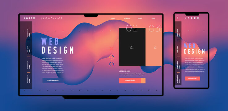
Responsive & Mobile Ready
In today’s mobile-first world, where smartphones dominate internet access, having a responsive or mobile-friendly website isn’t just a luxury—it’s a necessity. A truly responsive website fluidly adapts to any screen size, from expansive desktop monitors to compact 5.5-inch smartphone displays. Given the sheer variety of devices available, you can’t predict how your customers will access your site, but there’s a very high probability it will be from a mobile device. In fact, by 2017, approximately half of all global website page views originated from portable devices. Responsive web design ensures that regardless of the gadget a user employs, they’ll always experience a beautifully crafted and functional website.
Why is this so critical? Your website must seamlessly adjust to a user’s actions, especially when they’re on a smartphone. Failing to optimize for mobile means potentially losing out on sales because your content doesn’t display correctly across all devices. Think about your own experience Browse on a phone: if you have to constantly zoom in and out just to navigate or make a purchase, it’s incredibly frustrating. Most of your clients won’t tolerate such inconvenience; they’ll simply leave and likely won’t even consider your product again. You want visitors to effortlessly browse your website, no matter the platform, and easily complete their transactions or discover your brand. Food Sense, a website promoting plant-based diets, offers a great example. Its desktop site features both lateral and horizontal menu bars, but when accessed on a smartphone, the information flow remains smooth and clear. It manages to present all necessary details without appearing cluttered, demonstrating the power of a well-executed responsive design.
Enagaging Experience With Parallax Scrolling
You’ve undoubtedly encountered it, even if you don’t know it by name: parallax scrolling. This design technique creates a captivating sense of depth on a website, making images appear to emerge from the screen. The “super cool” effect of parallax is achieved by layering multiple backgrounds that move at different speeds as the user scrolls, creating a compelling 3D illusion. While some templates incorporate this feature, developing your own original parallax website can truly set you apart from competitors. Its primary appeal is purely aesthetic; it showcases a willingness to go the extra mile, demonstrating innovation and attention to detail to potential clients.
The key benefit of parallax scrolling lies in its ability to deliver a significant “wow” factor. Users don’t typically anticipate a dynamic 3D effect when they land on a website, so its presence immediately elevates the Browse experience. This engaging element is highly effective at increasing user retention, encouraging visitors to stay on the page and interact with your content. Websites like Firewatch Game and Aquatilis Adventure perfectly illustrate its power. While both utilize parallax scrolling in distinct ways, they successfully captivate users and keep them scrolling. Firewatch achieves its 3D illusion by artfully layering various backgrounds, whereas Aquatilis strategically incorporates animated animals that seemingly leap off the page, grabbing the reader’s attention and fostering prolonged engagement.
Seamless Email Integrations
Seamless Email Integrations: Building Your Audience and Driving Sales
You’ve guessed it: email. It’s a ubiquitous communication tool, with nearly everyone maintaining a personal inbox, whether it’s through Google, Outlook, or even legacy providers. If you’re offering any product or service, integrating email capture into your website is an absolute must. This foundational step allows website visitors to subscribe to your communications, initiating the growth of your email marketing list and enabling your broader marketing strategy.
Why is this so crucial? While potential customers can certainly seek out your products online, having their email address grants you direct access and influence. Consider this: a remarkable 8 out of 10 customers who opted to receive emails from a company made a purchase within six months based on the information they received. As a business owner, you’re undoubtedly focused on a high Return on Investment (ROI) for your marketing efforts, and email advertising consistently delivers significant conversions.
So, how does this benefit the user, and how can you approach it effectively? The key is to ask for email addresses in a thoughtful and creative way, rather than being intrusive. If someone is genuinely interested in learning more about your company, there’s a strong likelihood they’ll opt in. This gives you a direct channel to provide valuable information, updates, and perhaps even exclusive coupons. Take Knockaround, the California-based sunglasses company, as a prime example. Their email pop-ups are often dynamic and engaging, like one that rewards subscribers with a discount through an interactive “Click To Win” game. This playful approach not only entertains potential customers but also provides a unique way to connect with your brand. Done right, such innovative email integration can significantly contribute to a truly cool and effective website design.
Telling Your Brand Story
Telling Your Brand Story: Connecting with Your Audience on a Deeper Level
Telling your brand’s story is more than just sharing information; it’s about crafting a compelling narrative that offers consumers a profound and insightful impression of your business, product, or service. This approach goes beyond mere features and benefits, delving into the essence of your brand to evoke emotions, sustain user interest, and powerfully differentiate you from competitors. While creative web design can achieve remarkable feats, the underlying power of a compelling brand story lies in its ability to foster genuine connection.
Instead of simply stating facts, show your clients your company’s journey and values. Leverage a rich tapestry of text, sound, video, and imagery to weave a narrative that powerfully communicates why your brand is superior and why they should choose you. This unique feature not only prompts clients towards a purchase but also provides them with a compelling, emotionally resonant reason to do so. If you can authentically convey the history or origin of your business, you’re giving customers a strong justification for their investment. When executed effectively, this innovative strategy can even transform your audience into enthusiastic brand ambassadors – essentially, free salespeople who advocate for your offerings.
Consider the stunning website of Austrian coffee company J. Hornig Coffee, which masterfully dedicates itself to telling its brand narrative. Through an engaging blend of text, video, images, and audio, they immerse their customers in their story, allowing prospective buyers to fully understand their business. Notice how every component discussed – from seamless navigation and strategic white space to high-quality imagery and engaging CTAs – shares a common thread: they all work in concert to create a stunning, cohesive website that captivates visitors and facilitates easy comprehension. Ultimately, the collective goal is to persuade consumers to invest in your goods or services. When your website design is truly “cool” and thoughtfully executed, customers are not only more likely to make a purchase but also to enthusiastically recommend your site to others. It’s a straightforward path to turning your clients into powerful brand advocates, so ensure your website is top-notch!